
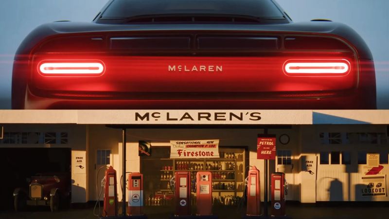
McLaren is entering a new chapter with a refreshed corporate identity. The company has unveiled a cleaner wordmark tied to its founder’s history, which will gradually spread across future production cars, merchandise and digital content.
The redesign takes its cues from the sign outside the family-owned Service Station in Auckland, New Zealand, which was operated by Bruce McLaren’s parents. The station was central to the young engineer’s development: it was where he modified a 1929 Austin Seven that took him to his first race and motorsport win at Muriwai Beach.
The new wordmark develops that original signage through a custom typeface called McLaren Sans. Its key details include a horizontal line beneath the letter C and an all-uppercase treatment, replacing the mixed-case format of the current logo. The flagship McLaren W1 could be the final new model to carry the outgoing badge on its nose.
McLaren is keeping both its iconic Speedmark and the Speedy Kiwi, a nod to its New Zealand heritage. The revised palette includes signature Papaya orange, Ember reddish orange, Midnight blue, Black, Anthracite, Colnbrook silver and Mist white. All of the colors were drawn from a single photograph of Bruce McLaren sitting on the tire of his single-seater.
McLaren says the evolved identity “brings together the marque’s past, present and future in one connected expression across McLaren Automotive and McLaren Racing”. The automaker also says its next era will deliver “deeper personalization, richer experiences and an even stronger sense of community” for owners and fans.
David Woodhouse, McLaren Automotive’s Chief Creative Officer, said:
“There is something uniquely special about McLaren. Throughout our history, we’ve never been content to follow established paths. We’ve always looked ahead, driven by a restless desire to innovate, create and push beyond expectations. This evolution of our visual identity captures that spirit. It’s a reflection of the journey we are on as a company. It marks the beginning of a new chapter for McLaren, giving a physical expression to the ambition, creativity and forward momentum that is shaping our future.”
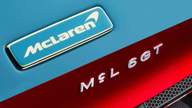
Although the new branding was unveiled today, McLaren previewed it when the McL 6GT debuted at Monterey Car Week last August. The mid-engined supercar uses a manual V8 layout and introduced a design language influenced by the classic M6GT racecar, with the new typeface positioned between its taillights. As suggested by the official video, the McL 6GT lettering has now been replaced with the complete McLaren wordmark.
The branding update arrives as the Woking-based automaker pursues ambitious expansion plans. McLaren recently announced plans for a second UK manufacturing site and a move toward in-house engine production, backed by a £500m ($668m) investment. Its product range will also grow to include front-engined, two-row models, including the company’s first SUV.


Buick’s Chinese lineup is about to gain a smaller Electra GS plug-in hybrid, highlighting the kind of electrified sedan GM lacks in America.

Kia honored Rafael Nadal with a full-size EV4 GT sculpture made using clay from the courts where the tennis legend earned his “King of Clay” nickname.

Toyota is preparing a specially equipped bZ electric crossover for Waymo’s driverless ride-hailing fleet, with operations planned to begin in Japan in 2027 before expanding to the UK and other supported markets.

Nissan’s SEMA lineup now totals six concepts, led by an especially radical open-top Armada built for extreme off-roading.
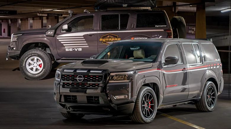
Nismo Nick is bringing two radically different ladder-frame Pathfinder projects—the Trackfinder and Trailfinder—to SEMA in celebration of the nameplate’s 40th anniversary.